
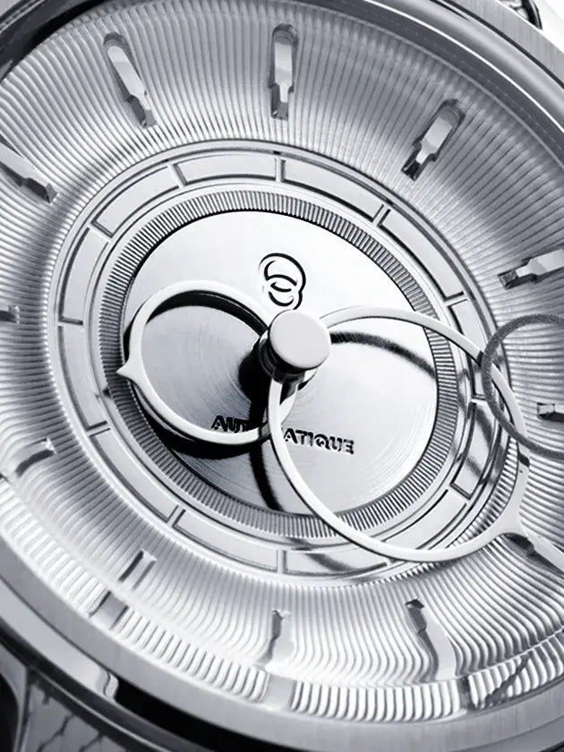
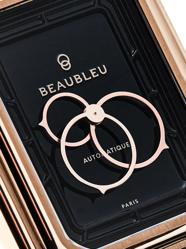
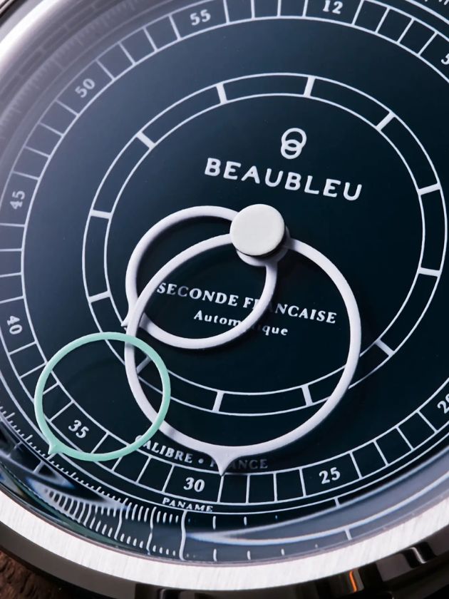
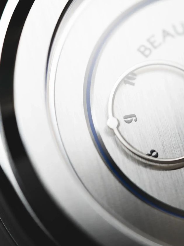




The green watch as a visual break
For a long time, watchmaking spoke three languages: black, white, blue. Anything else was considered daring or whimsical. Then green arrived, first in confidential editions, then as an accepted trend. Today, a green watch is no longer surprising; it makes a statement. At Beaubleu, blue remains the anchoring color, that of Paris and its identity. But conversation with other shades nourishes the reflection on the dial.
Key takeaways
- A green watch acts as a visual break because it deviates from the classic black, white, and blue triptych.
- Green comes in multiple shades that radically change the character of the timepiece.
- Independent watchmaking has popularized the green timepiece as an object of singularity.
- The dial color interacts with the strap and case; balance takes precedence over effect.
What a green watch really encompasses
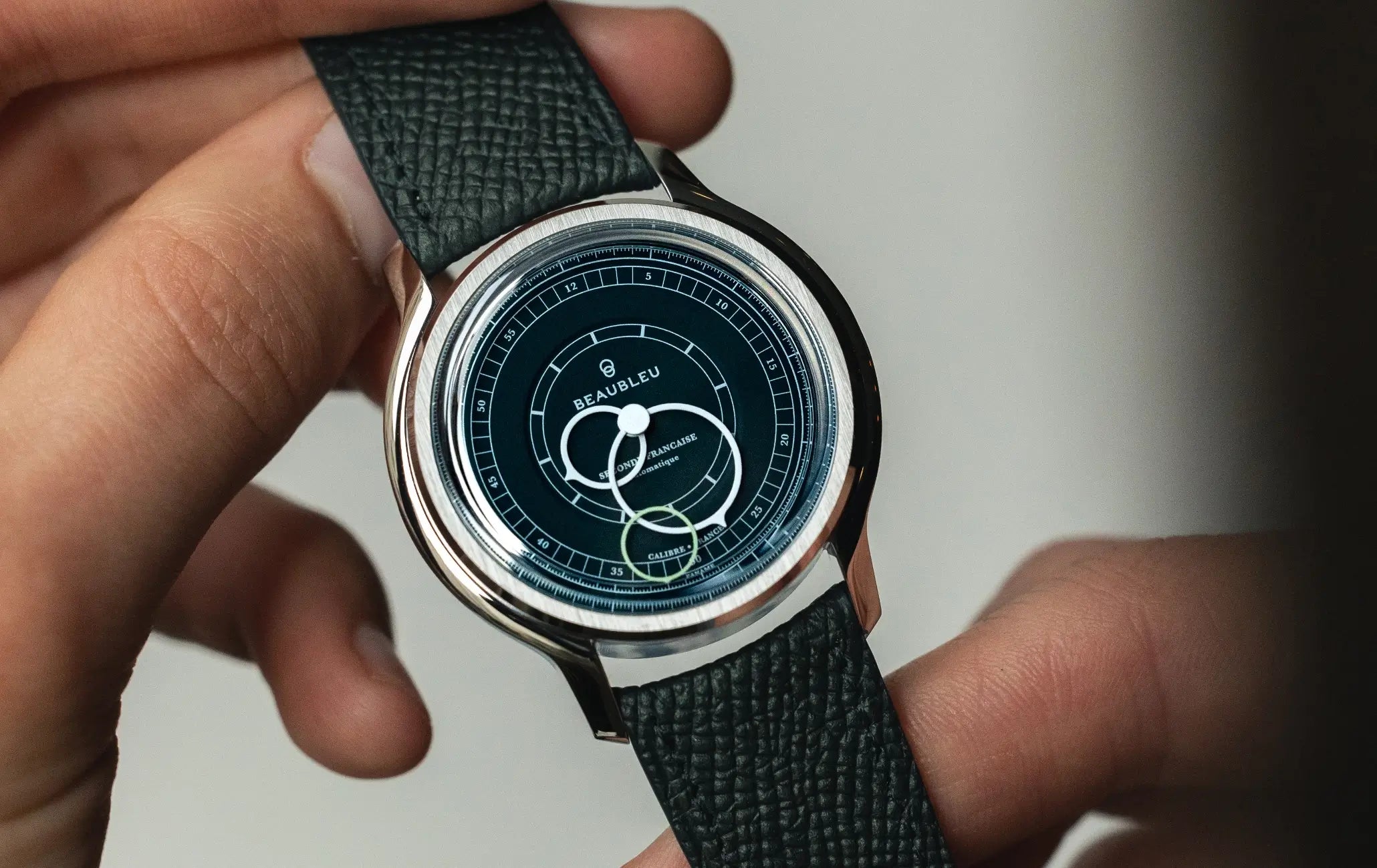
A green watch is a timepiece whose dial adopts a shade of green as its main color, from British racing green to mint green, including khaki and forest green. This simple definition encompasses a wide variety of visual realities. A deep forest green doesn't tell the same story as a light celadon green, and doesn't pair with the same outfits.
The nuance makes all the difference. The designer's job is to choose a shade that dialogues with the case, strap, and hands, so that the color aids in reading time instead of disrupting it.
Green as a break from the dominant triptych
The black, white, and blue triptych structured classic watchmaking because it guaranteed readability and versatility. Green breaks this consensus by introducing a color that doesn't fade into the background. A green watch doesn't go unnoticed; it declares an intention at first glance.
The nuances of green and their aesthetic scope
Forest green evokes the depth of the woods, British racing green recalls the leather of old libraries, celadon green borrows from porcelain. Each shade of green carries an implicit cultural reference, which informs how it is perceived. This referential density makes green a more literary than decorative color.
Olive green and khaki, on the other hand, come from military and utilitarian wear. A green watch in these shades dialogues with a different heritage, that of functionality turned chic. The choice of shade is therefore never neutral; it places the timepiece within a precise aesthetic family.
Discover the Seconde Française 19.24 - Imperial Green
Balance with the case and strap
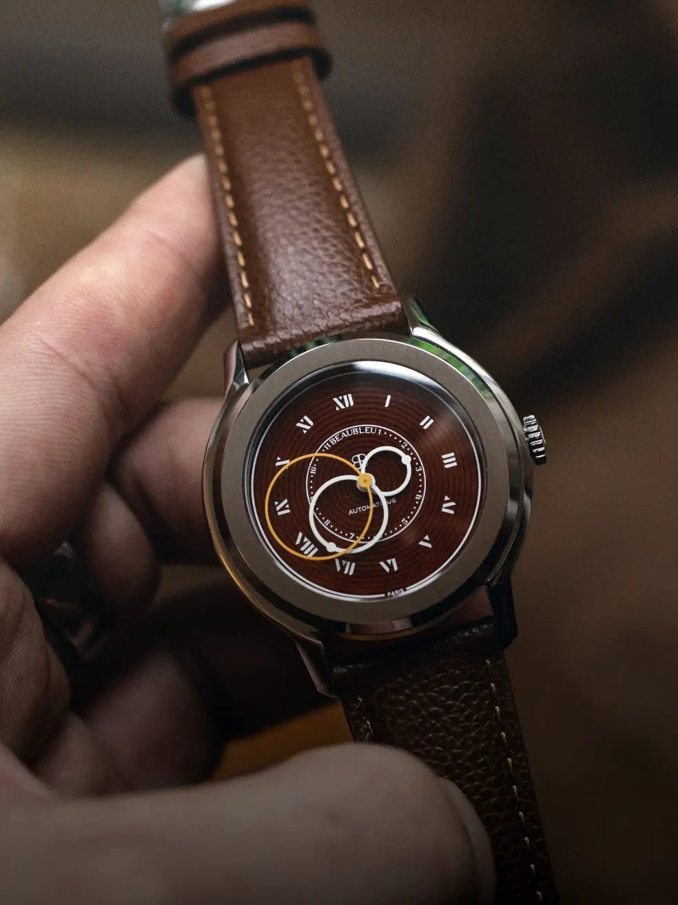
A green watch relies on the harmony between the dial and other components. A brushed steel case softens a vibrant green, a gold case amplifies a deep green, a black case radicalizes the whole. The same logic applies to the strap: cognac leather, steel, khaki canvas, each option redefines the piece.
Discover La Pièce n°1 - Olive Green
The Beaubleu interpretation: color as conviction
Maison Beaubleu champions blue as its foundational color, that of Paris and Parisian identity. This conviction does not prevent green from being considered a legitimate territory for exploration, especially for limited editions. A green watch signed by Beaubleu would be conceived not as a fashion trend, but as an aesthetic proposition consistent with the Maison's philosophy.
This philosophy is based on an idea: "beauty is always strange," as Baudelaire wrote. The right color is not the expected color; it is the color that surprises while making sense. Green, in this framework, is a strong candidate for those seeking watchmaking that is both singular and well-rooted.
Explore Beaubleu's limited editions and permanent collection to discover how color structures Parisian watchmaking creation.